About fonts
I fell into a bit of a rabbit hole after reading Matthew Butterick’s Practical Typography: I got a little obsessed with fonts for a while. It convinced me that I want my website to look pretty, and one important part of that is the choice of font. There are three applications of fonts that have been on my mind: headings and body text on my website, and a coding font for my editor (and also for code snippets on my website). Let’s look at each in turn, but first, let’s set some criteria.
Criteria for a font
The purpose of a font is to make text look good.
That’s it. That’s the criterion.
However, this is hard to determine. Of course, there’s no accounting for taste, but Butterick talks about a lot of fonts in his book, and mentions which ones are good and which ones aren’t. However, he doesn’t give a lot of guidance on how to see the difference. Blogs on the web claim to do so, but don’t go into a lot of depth and generally constrains themselves to free fonts.
Which leads to another factor: cost. According to Butterick, “most free fonts are garbage“. I don’t mind spending some money, but fonts can get really expensive. Butterick also designs fonts, and his seem to be relatively cheap. Still, it’s a lot of money for a website that doesn’t get a lot of traffic.
But sometimes, big-name companies such as IBM, The Smithsonian, Adobe 1, 2 and Mozilla release good fonts (that Butterick even approves of) and that are designed by renowned professionals, which is nice! In these cases though, for ideological reasons, I do prefer companies that have somewhat of a proven track record in free and open source software. For instance, all else being equal, I’d pick Mozilla’s Fira over IBM Plex.
Coding fonts have some other requirements as well. First of all, they need to be monospaced (well, for most people anyway), and they need to make the difference between certain symbols really clear: 0O, 1lI
Coding
So let’s talk about coding fonts first.
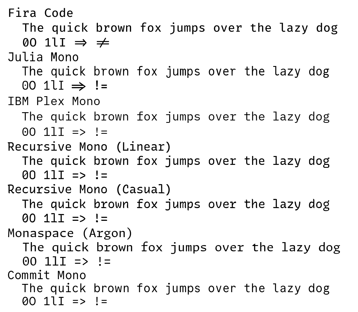
The rabbit hole opened up in front of me when I read the section on ligatures in programming fonts in Butterick’s book. He makes a few arguments for why they’re a bad idea, though I don’t think I ever experienced these problems myself. I’ve been using Fira Code (a fork of Mozilla’s Fira Mono with added ligatures) for a long while, and I have to say that I rather enjoy the ligatures.
But it did get me thinking, because I did get confused reactions sometimes from people looking at my screen, or at code snippets on my website or in my talks.
Also, Fira Code doesn’t have italics, so the font configuration in my terminal was kind of complex, pulling in a separate font for italics.
So I started looking around. I tried Julia Mono for a while, but the letters felt uneven to me. I looked at Gintronic which I think looks cute, but I wasn’t quite ready to drop $150 on it and risk getting bored with it later. I’ve also looked at IBM Plex Mono, which is free and open source, but at the same time designed by typography professionals. But it left me feeling meh. I also wanted to try Recursive Mono, but I couldn’t get it to work in my terminal, Kitty. Your mileage may vary, though.
Then I discovered GitHub’s new Monaspace font. I specifically liked its Argon variant. It has a very cool “texture healing” feature, which moves wide letters like m and narrow letters like i a few pixels to the side to make the text look more evenly spaced. But it’s not supported on my terminal. They’ve made a fix and promised to release it “soon”, but it’s been almost two months.
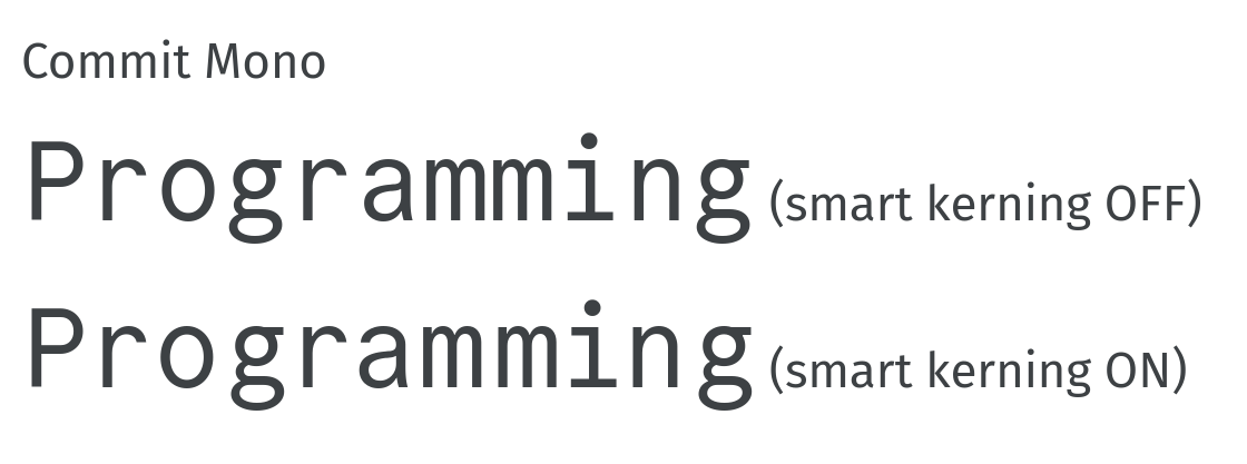
Eventually, I found Commit Mono, a relatively new open source font that also does texture healing (they call it “smart kerning”). It has a few basic ligatures, which I’ve disabled. It looks really nice, but you do notice the letters “jumping around” a little while you type because of the smart kerning feature. I’m currently trying it out to see if I mind the jumping around, but I do like the overall looks of it. And it has a nice italic! I’ve already integrated it into my website.
Here’s an example of Commit Mono’s smart kerning feature at work. It’s especially visible around the ms, which seem to have a lot more space:
UPDATE, March 1st, 2024: I’ve concluded that I find the jumping around of letters with Commit Mono a bit annoying, so I’m back on the hunt for a new day-to-day font. I was able to make Recursive work in my terminal, but decided that I don’t like the looks enough. A former coworker suggested I try Iosevka, which has all the features and then some. However, I just don’t like its narrow look. It’s great if you want to be able to see many columns of code in one window, but…I don’t. I prefer to see many lines at the same time, which means a wider font is more suited for me. I’d love to use Monaspace Argon, but GitHub still haven’t provided a new release, so it still doesn’t work with my terminal. I’m currently trying out the trial version of MonoLisa, which looks nice and ticks all the boxes, but I haven’t decided yet if I want to actually drop the cash on that one (though it’s relatively cheap for a font!) I could also see myself go back to Fira Code, but with ligatures disabled. In that case I’ll have to find another font to provide the italics, though.
For the code samples on the website, it seemed clear to me that I should revert to Fira Code, for the simple reasons that a) I don’t use the italics there, and b) the body text is FiraGO (spoilers for the next section!), which is basically the same font. This makes things satisfyingly consistent. I mean, look at how those g’s look:
FiraGO: g
FiraCode: g
Body text
I’d never really considered the font of my website’s body text before. The theme I use sets it to this by default:
-apple-system, BlinkMacSystemFont, "Roboto", "Segoe UI",
    "Helvetica Neue", "Lucida Grande", Arial, sans-serif
In other words, it selects whatever default font is installed on the system. This means two things:
- My site will look different on different devices, and
- My site will look like every other site, and therefore boring.
As Butterick says, “like Times New Roman, Arial is permanently associated with the work of people who will never care about typography“
So I thought it would be nice to change it up a little, to give my site that little extra je ne sais quoi, to make it stand out from the pack without readers necessarily noticing why.
I mainly looked at sans-serif fonts, because I think these look nicer on screen. I did consider Butterick’s own font Heliotrope for a bit, but it has a slight weirdness to it which I decided doesn’t fit with my heading font of choice (see below).
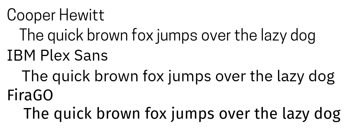
Some sans-serif fonts I looked at were Cooper Hewitt and IBM Plex Sans, but I didn’t really like how they look.
In the end, I landed on Fira Code’s cousin FiraGO, the successor to Mozilla’s Fira Sans. I think it looks nice! I particularly like the little opening in the bottom half of the g.
And you’re looking at it right now!
Headings
Headings should look different from the body text, because their point is to reveal structure. Therefore, you can use a different font for them
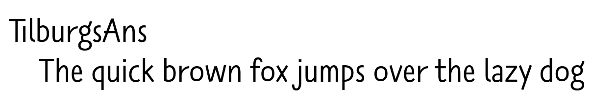
My love for TilburgsAns is no secret. This font is an art project from my home town and it’s used there for many different things, like event announcement posters, shop window signs, and wine bottle labels.
It’s not a free font, but it has a very permissive license. Instead of paying for it, you can “adopt” a letter (each letter can be adopted only once) or a space (unlimited supply). I have adopted space #256.
I’ve used it for various private projects over the years, including my daughter’s birth announcement card. I’ve used it in the slides for my talks, and in fact, I’d already switched this site’s headers to TilburgsAns a few months ago.
Butterick warns against using goofy fonts in serious documents. I’m not sure if TilburgsAns qualifies as one, but I don’t care, I’m keeping it.
What I’ve learned
- Apparently, I prefer humanist fonts over (neo-)grotesque or mechanic ones. The Monaspace website makes it easy to see the difference; generally, humanist fonts are more irregular. It’s not a deal breaker for me though.
- Speaking of grotesque, in the context of fonts, it means something completely different.
- And speaking of words, when people say font, they really mean typeface, but no-one really cares and neither do I. I’ll just continue saying font even if I mean typeface.
- Font websites can be really out there. Check out Gintronic, Commit Mono, and IBM Plex. The IBM Plex one is especially infuriating.
- Many fonts have configuration options, with descriptive names like
ss01,ss02, andcv01, which define the shape of certain letters or ligatures. They’re fun to play with!
The end?
Of course, Butterick’s Practical Typography has taught me a few things.
First of all, it brought home the point once more that making things available on the internet for free, is never actually really free. So if you’ve read his book as a result of this post, consider paying for it. I have.
More importantly, the book has taught me that there’s more to making websites look good than just fonts. Much, much more. Way more than I thought. And since reading it, there’s loads of things I’d like to change about my website.
But I’m not going to do it. I’m not jumping into another rabbit hole.
At least not right now.
Therefore, I will leave you with a screenshot of what this page looks like right now. If you notice that this website looks very different, you will know that I’ve plunged into that rabbit hole after all. And that I’ve re-emerged. In that event, send me a message and ask me if I’m alright!